Memorigi: Quick Impression of A Minimalist Todo Application
After exploring Google Task for daily todo application, it got me thinking. I do like the idea of Google Task trying to present. A simple & minimalist todo application, that everyone can use right away. But still for me, features that Google Task provide still limiting for my personal use. So, I wonder is there any other todo application that also offer a minimalist concept but have more feature compare to Google Task.
After crawling the internet for certain period of time, I found another minimalist todo application: Memorigi. Let's dive in to the app.

What is Memorigi ?
Memorigi is a visually-oriented to-do list, task manager, planner, calendar, and reminder app to help you organize life and work. It's available on mobile (Google Playstore & Samsung Galaxy Store) and web.
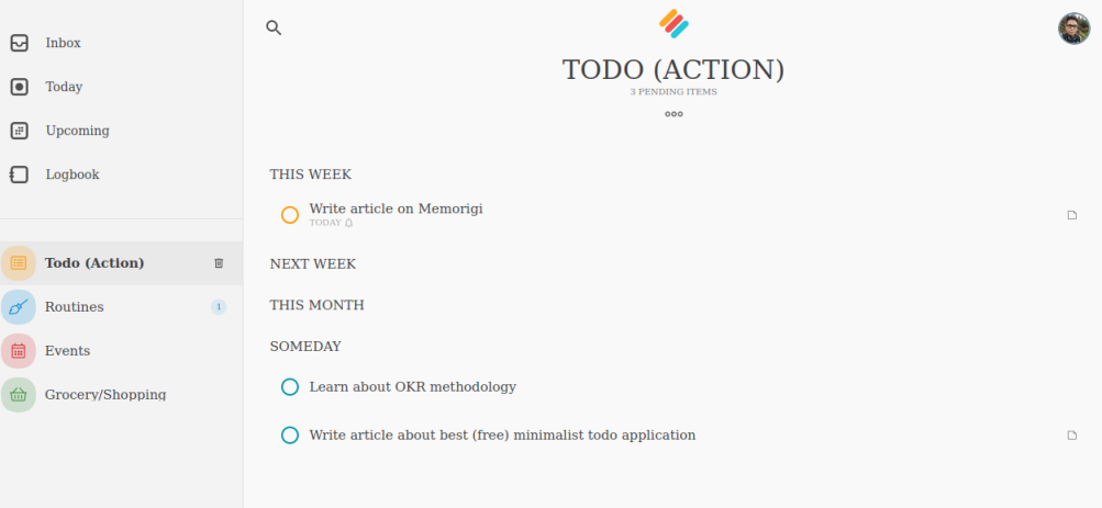
It offer list & groups as a primary way to organize tasks. List in Memorigi is similar like project, to group several task that have similarity to achieve the same goal. Because I prefer to make things as simple as possible, I'd setup Memorigi with 4 list, ie.: todo (action), routine, events, and shopping list. Also you can use group to bundle together projects and task based on certain category. What interesting me, Memorigi also offer headings which can be used to break down project tasks into smaller parts.
Out of the box, Memorigi comes with 4 list already, i.e: Inbox, Today, Upcoming, Logbook. Inbox is the default list for every new task you've created. Today is useful if you want to see all tasks that need to be done by today. Upcoming, is for all your upcoming task. And logbook, is for all tasks that you've completed.
Other features that Memorigi offers is similar like other todo application: sub-task, priority, tags, set due date, recurring task, and attachment. Subtask, priority, tags, and attachment is only available for premium user. Even though setting task priority is locked under premium plan, there's a workaround for that. I'll explain it later.
Memorigi also has calendar view to see tasks and projects due in the next days and further. You can integrate your Google Calendar to see events as well. To make it fancy, you can use icons & colors to personalized your tasks & projects.
![]()
Pros & Cons
What I consider as a pros for Memorigi:
- Able to add notes/description to the tasks
- Minimalist layout design
- Grouping tasks using list & headings
- Calendar view to see upcoming tasks
- Adding icons & colors for personalization
What's the cons:
- There's no swipe gesture on mobile application
- Can't add checklist into task description
- Some core feature of a todo app is locked under premium plan (sub-task, priority, tags).
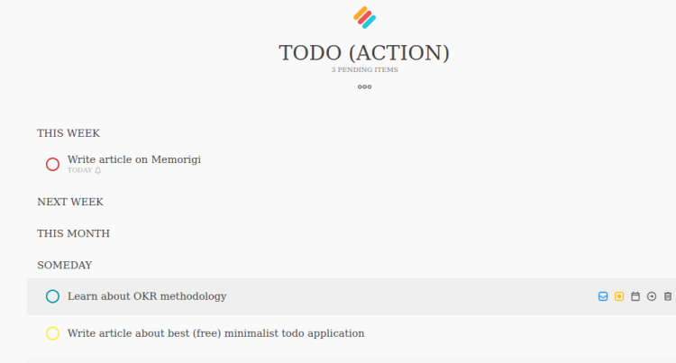
Even though setting task priority is locked only for premium plan, you can use task color to achieve the same result. For example:
- Red color for high priority task
- Yellow color for medium priority,
- Blue color for low priority

Final Thoughts
I really love Memorigi. It has all the basic feature I need for a todo application, even though it's not as full pack feature as TickTick (read my review on TickTick here). I really like the capability for adding heading in your task list for better organization. It's similar feature with adding section on kanban board in TickTick or Todoist. A little downside is some of core feature of a todo application, such as: creating subtask, set priority, and tags is locked under premium plan. But, that's doesn't stop me from enjoying using this application. For setting priority as workaround, we can use color to differentiate task by priority. Compare to Google Task, personally for me Memorigi it's the better option.
This app is definitely in one of my top 5 todo application that I'd recommend. So, just give it a try and let me know what do you think about this app in comment section below. Cheers!
